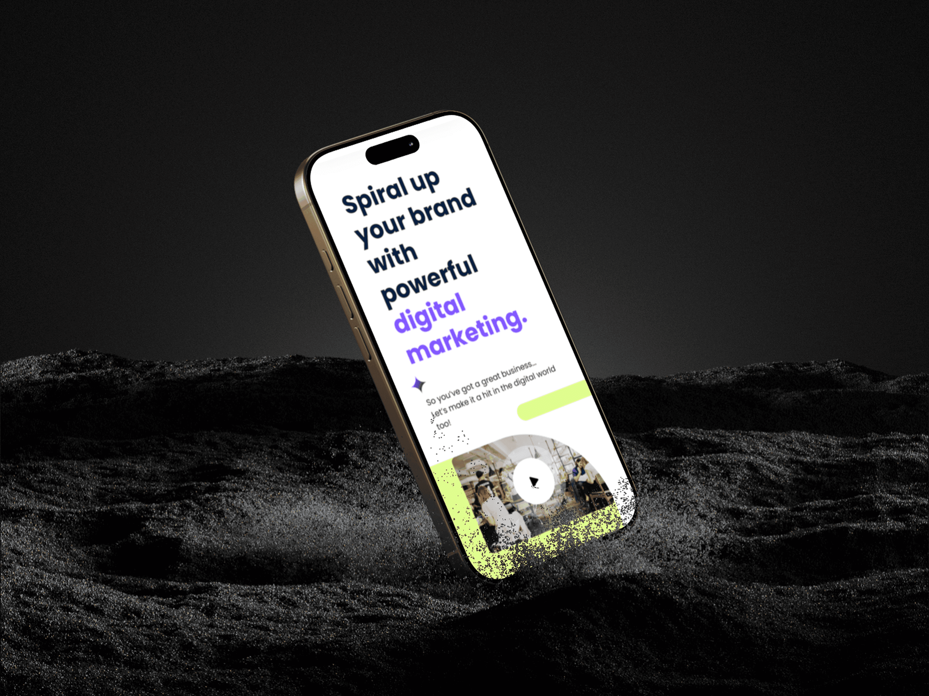
Spira9 is a digital marketing company that aims to position itself as a market leader, by launching a brand-new AI website builder. The company, however, struggles with visibility and customer flow due to the lack of a dynamic and engaging website. Our goal was to redesign the website, improving its UX/UI to provide a seamless, intuitive, and enjoyable experience for users, ultimately increasing user conversion and improve user satisfaction.

Client Project
Digital Marketing
AI website building
UX Designer
UX Writer
UI Designer
4 weeks
Challenge
The site we are building is not only a store front for Spira9, but also a showcase and template for the company's AI website building service, to increase site visits and conversion rates.
The previous website had a cluttered interface and a vague structure, making it difficult for users to navigate and find main services, leading to a high bounce rate, and low time on page. Moreover, the lack of responsive design has led to a higher bounce rate from mobile devices.
Results
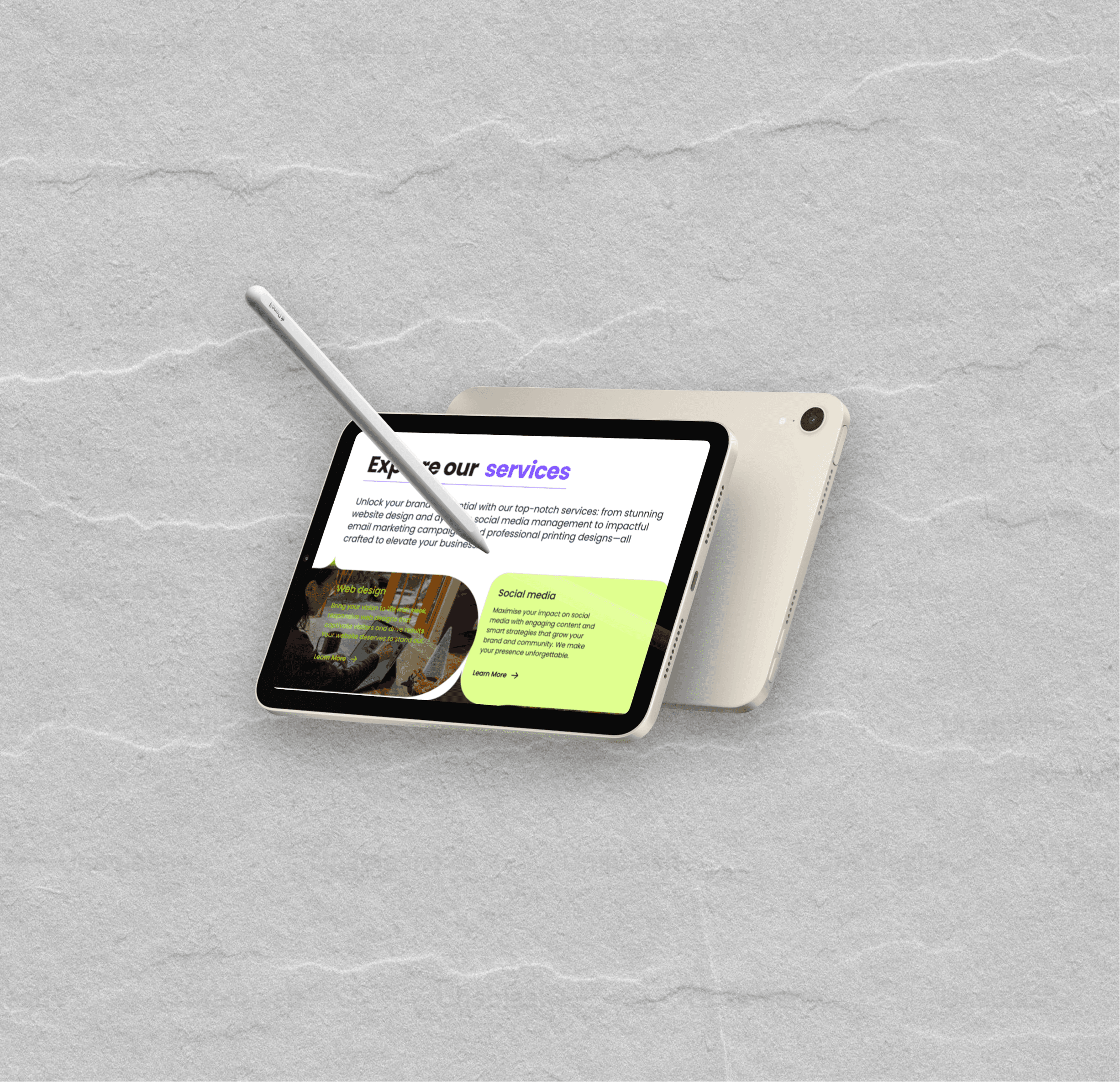
The redesigned website features a minimalist, dynamic and responsive interface, providing users a seamless and intuitive browsing experience.
The success of this project will be measured with: user conversion rate, average session duration and pages per visit, from different end devices.
22%
Increase in conversion
30%
Increase in session duration
35%
Pages per visit


Process
Understanding & Alignment: We participated in project brief to understand the brand identity and mission, the goals and objectives of this project, and defined and outlined key deliverables.
Research & Analysis: We conducted market analysis to understand the competitive landscape of digital marketing services and AI website builder, as well as industry trends and information architecture best practice.
Information Architecture: Based on the research findings, we restructured the app's navigation and pages, streamlining features and information according to user needs.
Wireframing & Prototyping: We designed low-fidelity wireframes to visualise the new layout and navigation to tell the brand story, iteratively refining them to align with the business goals, and designed engaging and witty content. Afterward, we built a high-fidelity, interactive prototype to test the design.
Usability Testing: We conducted usability tests to validate the design and identify areas for improvement. Based on the feedback, we made necessary adjustments to the design.
Engineer Handoff: We iterated on the previous designs based on developer feedback on feasibility, before designing different breakpoints for responsive design.
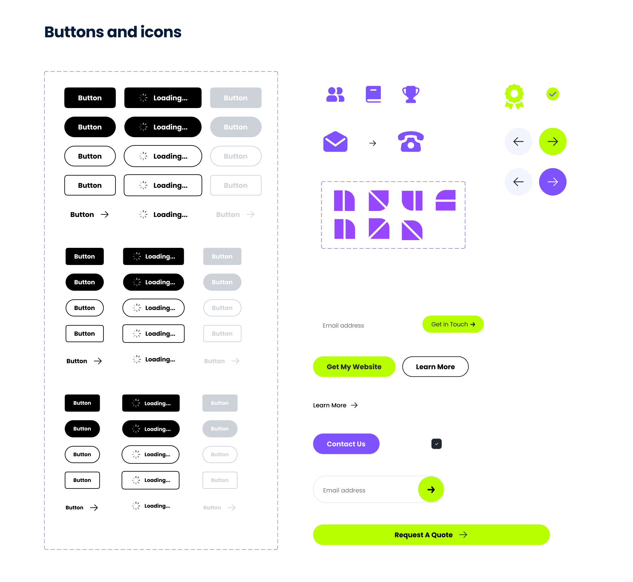
Visual Design & Style Guide: We developed a cohesive visual language, including color schemes, typography, and iconography, ensuring consistency throughout the website. We also created a style guide to maintain design consistency in future updates.


Conclusion
The website redesign successfully addressed the usability issues, resulting in a more intuitive, responsive and user-friendly experience. The improved UX/UI design led to increased user conversion, session duration, and user satisfaction, while retained brand image and design consistency.
Reflection
Dance in chains
This website project differs from others in the way that it also acts as the basic template for a scalable AI Web-building service, and is very restrictive regarding layout changes and interactive elements.
The compromise made between the design and development teams was that designers can change section background, add visually guiding elements and potentially change the general layout (e.g. from horizontal to vertical).
Design system should not be an after-thought!
Having learnt from my previous experience toiling with choice of colour and fonts, I set a style guide before my hi-fi design, which helped greatly with the consistency of the final design.
However, as we worked as a team, and the colour palette was not executed strictly from the beginning, changes had to be made when organising the design system.
Use colours wisely (when you have to use them).
Colour is abused a lot of the times. In order to make a change, I started with grey scales for this project to identify the hierarchy of fields and information, and refrained from the use of colours to give the page a cleaner look.
You might also want to check out…
FamCook - A Cook-Together App
From discovery of current practice to user testing and design iteration, Project FamCook sets out to design a smooth and enjoyable co-cooking experience.
Task Success
50% ↑
User Satisfaction
30% ↑
Quabble - Daily Mental Wellness
UX audit to identify usability issues, as well as potential user frustration and confusion interacting with the product.
User Engagement
15% ↑
User Satisfaction
10% ↑
